Configuring the Enterprise Landing Page Using the Style Editor
Display Preferences for Self Service Role
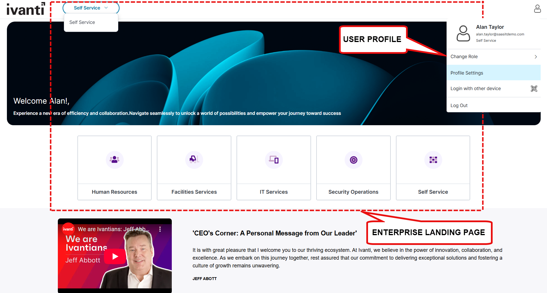
Typical Self Service home page
To configure the page display option for self service roles:
1.Navigate to Configuration Console > User Interface Style > Style Editor.
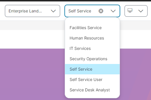
2.In the Exceptions / Custom Roles section, select one of the following options:
•Enterprise Landing Page - Displays all roles as tiles, based on the roles selected in the Exceptions / Custom Roles section of the Style Editor. To view options or menu available for a self service role, select the Self Service dropdown list, or click on the Self Service tile.
•Self Service Extended Role - Displays details specific to the selected self service user role, showing a more focused view tailored to that role.
Navigation menu
After selecting the role, you can view the Menu icon displayed on the left side of the screen. By default, it includes:
•Home
•Incident
•Service Request
•My Items
•Announcement
•Knowledge
To configure other features, see Configuring Workspace.
Working with Enterprise Landing Page
The Enterprise Landing Page provides a centralized navigation hub for accessing various Self Service portals or business areas such as HR, IT, or Marketing.
To access the Enterprise Landing Page feature create or add an exception to the role.
1.Log in to Neurons for ITSM as an Administrator.
2.Go to Configuration console > Build > User Interface Styles > Style Editor.
3.In Exceptions / Custom roles select or create a role exception.
4. In the Self-Service Page Options column, select Enterprise Landing Page.
Editing the Enterprise Landing Page
1.Log in to Neurons for ITSM as a Self Service user, and change the role to Administrator user.
2.Click Edit Page on the top right corner of the page.
The Page Designer page is displayed.
3.From the Page Designer, select a role which has access to the Enterprise Landing Page.
4.Select the Enterprise Landing Page workspace to edit the landing page content.
To edit and design the Enterprise Landing Page, choose the different options in Page Settings and Global Settings.
The Page Settings tab contains the following page elements:
 Sections/Rows
Use the Sections/Row tab to add sections, and specify background colors and images. You can also drag the modules onto existing sections to rearrange them within the layout.
To add sections:
1.Click Sections/Rows. You can add 1-column, 2-column, 3-column, and 4-column sections to your page design based on your requirements.
2. Once you drag the sections onto the page, the Drop Modules here box appears, allowing you to drag the modules you want to create for your page design.
3.Drag the sections you want to add to the page; the Settings panel appears. Enter the following details.
| Field | Description |
|---|---|
| Name | Enter a name for the section. |
|
Number of columns |
Select the number of columns to display in the section. |
|
Background Color |
Select a background color for the section. Use the Background image toggle icon to enable or disable the background image. You can also edit or delete the image based on your requirement. Click Add image and select an image for the background. |
|
Background Width |
Background width. Use the Rounded Corners toggle icon to enable or disable rounded corners. |
|
Responsive |
Under Responsive, two options appear: Hide on Desktop: Enable or disable to hide or show the entire section/row only in desktop view. Hide on Mobile: Enable or disable to hide or show the entire section/row only in Mobile view. |
The following buttons are also available in the Sections/Rows:
•  to clone a widget.
•  to arrange the section.
•  to delete the section.
Modules
For Enterprise Landing Page it is recommended to limit the usage of Hero banner, List Widget, and Search Bar as the call-to-actions or links inside these modules leads to uncertain behavior.
Use the Modules tab to create custom widgets, hero banners, search bar, add text and media, and quick links.
To add a Text box:
1.Click Modules.
2.Under Widgets, drag the List icon to the page section. The Settings panel appears on the right side on the page.
3.Enter the following:
| Field | Description |
|---|---|
| Name |
Name of the text box. |
|
Widget Title |
Title for the text box widget. |
|
Title Alignment |
Select an alignment Center, Left, or Right for the title. |
|
Title Color |
Select a text color for the title. |
|
Widget Height |
Select Auto to automatically assign the text box height. Select Custom to specify the height of the widget (pixels). |
|
Add content |
Click to open the text editor. You can configure the font size, color and format, add lists, links, and configure the background color. |
|
Responsive |
Hide on Desktop: Enable or disable to hide or show the entire module only in desktop view. Hide on Mobile: Enable or disable to hide or show the entire module only in Mobile view. |
To add an HTML Text box:
1.Click Modules.
2.Under Widgets, drag the HTML icon to the page section. The Settings panel appears on the right side on the page.
3.Enter the following:
| Field | Description |
|---|---|
| Name |
Name of the HTML text box. |
|
Widget Title |
Title for the HTML text box widget. |
|
Title Color |
Select a text color for the title. |
|
Title Alignment |
Select an alignment Center, Left, or Right for the title. |
|
Widget Height |
Select Auto to automatically assign the text box height. Select Custom to specify the height of the widget (pixels). |
|
Add content |
Click to open the HTML text editor. You can configure the font size, color and format, add lists, links, and configure the background color. |
|
Hide on Desktop |
Enable to hide the link section in desktop view. |
|
Hide on Mobile |
Enable to hide the link section in mobile view. |
To add Quick Links:
Use Quick Links to display useful links to Business Objects, workspaces or web pages. Quick Links can be displayed in your page design as lists, tiles, or a carousel.
1.Click Modules.
2.Under Widgets, drag the Quick Links icon into the section you want them to appear.
3.In the Settings panel, specify the following:
| Field/Option | Description |
|---|---|
| Name | The name displayed on the Quick Links box tab - shown in the Page Designer only. |
| Widget Title | A title for the Quick Links widget. The title is shown on the published page (default name is Quick Links). |
| Layout options | Select a layout option from the drop-down list - List, Tile, Carousel, or Button Group |
| Alignment | Only displayed for the Tile layout. Select the link display alignment. |
| Show Thumbnail | Only displayed for the Tile and Carousel layouts. Enable to display links as thumbnails. This option is available for the Tile and Carousel layouts only. Enabling this option displays additional configurable options when configuring links in step 4 below. |
|
Number of items to display |
The number of links to display in the widget. If you add additional links in the link Options editor, you may need to increase this value to ensure the additional links are displayed. |
|
Add Links |
Opens the link Options editor where you configure each individual link, or add additional links. |
|
Hide on Desktop |
Enable to hide the link section in desktop view. |
|
Hide on Mobile |
Enable to hide the link section in mobile view. |
4.Click Add Links to add a Title for each individual quick link, the Link type, Link to details, and configure the link placement, title background color, and title font color.
| Field/Option | Description |
|---|---|
| Title | Name for the link. |
| Translator | Click to select a translation language and provide a translation for the title text. |
| Link Type | Select the link type as URL or Role from the drop-down list. |
| Link To |
Define the destination for the link. This is dependent on the selection you make in the Link Type drop-down list, URL or Role. If you have selected Role it will display only those roles that has the Self Service Extended exception. |
|
New Window |
Only displayed for a URL link type. Select to open the link in a new browser window. |
| Title Placement | Only displayed for Tile and Carousel layouts. Select the link title alignment. |
| Title Background | Only displayed for Tile and Carousel layouts. Click to open the color editor and define the link title background color. |
| Title Font Color | Only displayed for Tile and Carousel layout. Click to open the color editor and define the link title font color. |
| Thumbnail Type | Only displayed if you enable the Show Thumbnail option. Select the thumbnail type from the drop-down list, can be an icon or image. |
| Change | Only displayed if you enable the Show Thumbnail option. Click to select a different icon or an image for the thumbnail. |
|
Thumbnail Background |
Only displayed if you enable the Show Thumbnail option. Click to open the color editor and define the thumbnail background color. |
5.Click Ok.
To add custom widgets:
1.Click Modules.
2.Under Widgets, drag the List icon. The Text box appears. Specify the following details:
•Name
•Widget Title
•get data
•Saved Search
•Sort by and Sort order
•Number of items to display/Limit
3.[Optional] Click Options to select the following options:
•Header click
•Item click
•See all click
•Title
•Description
•Text
4.[Optional] Click Save as custom widget to save the widget.
The saved widget appears under custom widgets.
-
For the Global Settings tab, refer to Working with Global Settings.
-
The Enterprise Landing Page is controlled by the global constant Config Homepage for ESM. By default this global constant is False, set it to true to render the Enterprise Landing Page and its workspace.
-
The Hero Banner, List, and Search modules are not supported on the Enterprise Landing Page.